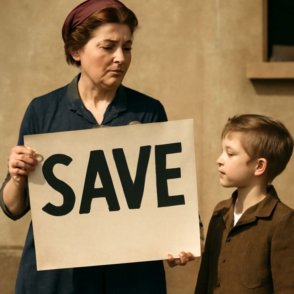
Propaganda posters are a communication form designed to move a defined audience toward a belief or action. Unlike purely decorative art, they combine imagery, wording, color, scale, and placement to deliver a repeatable public message. The goal may be recruitment, fundraising, increased production, secrecy, obedience, or hostility toward an enemy.
World War 1 propaganda posters and WWII designs use similar visual tools, but their priorities differ. A practical analysis identifies the audience, the central symbol, the emotional appeal, the information left out, and the action the poster demands.
How to read propaganda posters as a communication form
A poster becomes propaganda when an organized government, military, institution, or movement uses persuasive communication to shape public behavior or opinion. The following five questions reveal how the message works:
- Who is the audience? Look for clues such as age, gender, occupation, nationality, or military status. A uniformed man may address recruits, while a factory worker may address civilian laborers.
- What visual symbol carries the message? Flags, crowns, uniforms, weapons, children, national figures, and enemy caricatures have meanings beyond their literal appearance.
- Which emotion is being activated? Duty, pride, fear, shame, anger, hope, and belonging can all turn an abstract policy into a personal decision.
- What has been omitted? Posters simplify. A recruitment image may show honor and comradeship while excluding injury, death, or political disagreement.
- What action is intended? Imperatives such as “enlist,” “buy,” “save,” “work,” or “keep silent” identify the practical outcome sought by the sponsor.
Composition also matters. A large figure placed in the foreground appears authoritative; a direct gaze can make a mass campaign feel like a personal appeal; red, black, and strong contrasts can create urgency or danger. Short text makes the message easy to remember and reproduce across public spaces.
World War I propaganda posters: recruitment, duty, and fear
Many World War 1 propaganda posters addressed potential soldiers and civilians who could support the war through money, labor, or social pressure. British recruitment posters often turned military service into a test of personal honor. In Lord Kitchener’s famous “Britons: Lord Kitchener Wants You” design, Kitchener points directly at the viewer. His stern expression and commanding gaze create the impression that the nation is addressing one individual.
The 1917 American “I Want You for U.S. Army” poster by James Montgomery Flagg uses the same direct address through Uncle Sam. The national personification, pointed finger, and second-person wording make enlistment appear like a personal obligation rather than a distant government policy. The image also uses transfer: the authority of the nation is attached to a recognizable human figure.
Other recruitment designs relied on guilt. “Daddy, What Did You Do in the Great War?” shows a father seated near his children, with the daughter asking the title question. The scene projects future judgment onto the present. A man who refuses to enlist is not merely inactive; he may later have to explain that choice to his family.
World War I campaigns also promoted war loans and conservation. These posters commonly displayed flags, idealized families, soldiers, or prosperous homes. Such images linked financial support with patriotism while presenting sacrifice as orderly and worthwhile. A WW1 propaganda poster could therefore target civilians as directly as soldiers, asking them to buy bonds, save food, or pressure others to serve.
WWII propaganda strategies: unity, sacrifice, and the enemy image
WWII propaganda addressed societies already organized for total war. Its subjects included soldiers, industrial workers, mothers, children, consumers, and civilians responsible for protecting information. The message shifted from enlistment alone toward production, endurance, security, and national unity.
Britain’s “Keep Calm and Carry On” poster uses a crown, generous empty space, and a short imperative in a formal typeface. The design presents composure as a civic duty. The 1943 American “We Can Do It!” poster shows a woman worker with a raised arm and rolled sleeve. Its confident pose and bright colors present industrial labor as capable, collective, and patriotic, while leaving the dangerous and exhausting conditions of wartime production outside the frame.
Security posters used simpler cause-and-effect warnings. “Loose Lips Might Sink Ships” connects casual conversation with possible naval loss through rhyme and an easily remembered phrase. Posters such as “Careless Talk Costs Lives” made secrecy a personal responsibility. Soviet artist Irakli Toidze’s “The Motherland Calls!” uses a raised hand, urgent expression, and oath-like text to turn national defense into an immediate summons.
Enemy imagery also became more prominent. Axis leaders and soldiers could be shown as monstrous, predatory, or corrupt, sometimes alongside stark national symbols. These images encouraged fear and anger, but analysis should distinguish a specific dehumanizing device from a general wartime illustration. The propaganda function lies in the organized attempt to produce a defined response, such as enlistment, hatred, compliance, or vigilance.
Name-calling propaganda and card-stacking propaganda across both wars
Two important labels are name calling propaganda and card stacking propaganda. Name calling assigns a degrading label to an opponent instead of offering evidence about the opponent’s actions or policies. World War I posters that called German soldiers “the Hun” used a national enemy label to suggest brutality and savagery. WWII designs that reduced an entire enemy population to a racial or political caricature used the same shortcut. The label simplifies judgment and discourages sympathy or investigation.
Card stacking presents only the facts, images, or outcomes that support the sponsor’s position. A war-bond poster may show a secure family, a waving flag, and a victorious soldier while omitting taxation, financial risk, and battlefield casualties. A production poster may show a strong, smiling worker and record output while omitting fatigue, injury, or unequal burdens. The selected details may be true, but the incomplete picture steers interpretation.
Other techniques frequently appear alongside these devices:
- Bandwagon: suggests that honorable or patriotic people are already enlisting, buying bonds, or working harder.
- Transfer: attaches the authority of a flag, crown, national hero, or religious symbol to the requested action.
- Glittering generalities: uses broad terms such as freedom, victory, duty, or unity without defining their costs.
- Fear appeal: shows invasion, betrayal, military defeat, or harm to children to make compliance feel urgent.
- Repetition: repeats a slogan, color scheme, enemy symbol, or command until the association becomes familiar.
Across both wars, the core formula remains audience plus symbol plus emotion plus selective information plus action. World War I posters often pressure individuals through honor, shame, and recruitment. WWII propaganda more often presents the whole population as part of a coordinated system of soldiers, workers, consumers, and guardians of information. Comparing those elements shows not only what each poster says, but how its design makes one response appear natural and alternatives difficult to see.